SmudgeGuard
Prevent smudges and keep hands comfortable while drawing or using touch-screen devices.
SmudgeGuard
Role// UX/UI Design Year// 2024 Tools Used//Figma
SmudgeGuard.com specializes in selling art guards, a product primarily aimed at artists, designers, and anyone who draws.
Purpose and Context
The current website faced several usability issues that hindered customer engagement and conversion. The owner wants me to redesign SmudgeGuard.com, an older e-commerce website from 2008, to improve its sales conversion rates.
Goals
The primary goal that I wanted to do is to enhance the user experience by improving readability and simplifying the shopping flow on SmudgeGuard.com. This redesign aims to increase sales conversion rates and overall customer satisfaction
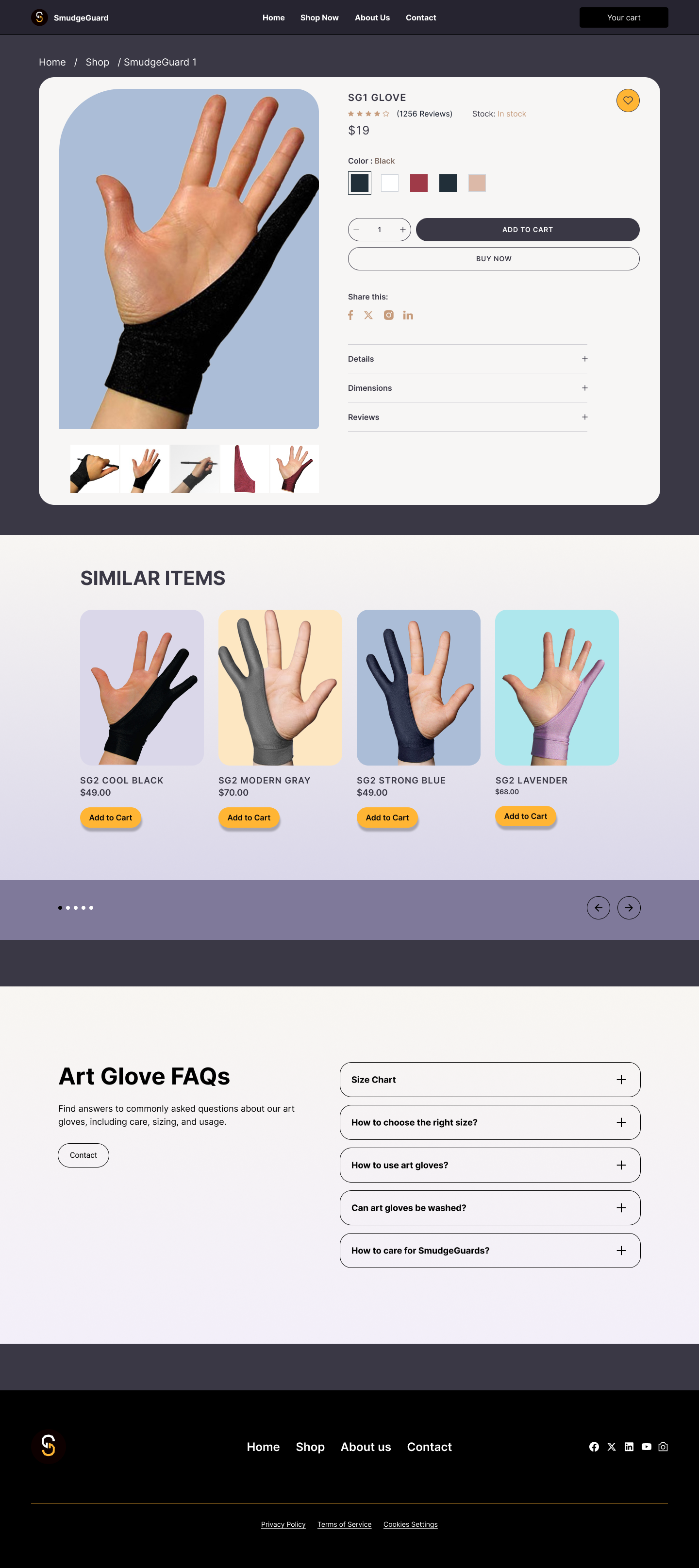
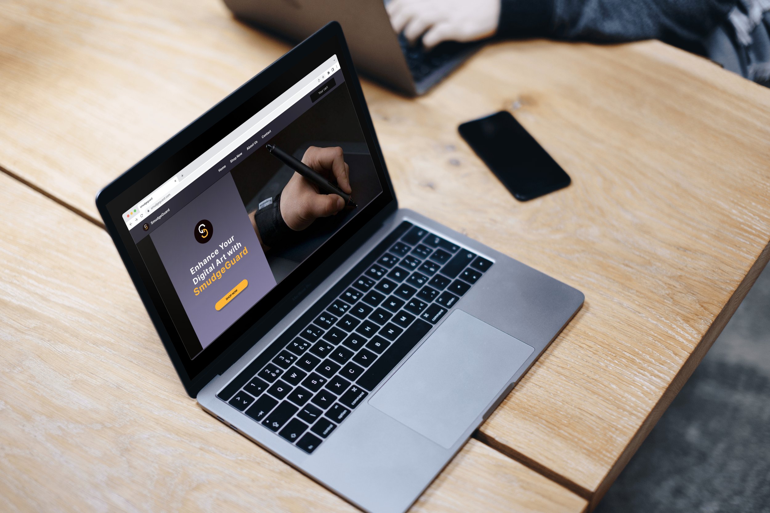
Before

After

Design Process
Current State Evaluation: I started the process by getting to know the state of the existing product and evaluating the website layout and content to discover the main focus areas that can be improved.
Current Website Review: I then conducted a thorough assessment of SmudgeGuard.com to pinpoint key issues and tried to go through the customer journey in purchasing a Smudgeguard glove.
Competitor Analysis: I later compared a couple of important components of Smudgeguards competition. I found that the art glove market was more advanced when it came to making their design responsive, highlighting the user benefits, and generally excelling in the usability department.

Interviews & Findings:
I had 1-on-1 user interviews that allowed me to discover how they navigated through the older website and what they expected.
My key findings:
Readability Issues: The existing website had small, poorly contrasted text that made it difficult to read.
Navigation Difficulties: The site’s navigation was not straightforward, making it hard for users to find products and information quickly. Overall they were overwhelmed.
Shopping Flow Problems: To add to the problem above, the process from trying to find the product to checkout was not intuitive, causing potential customers to abandon their carts.
These key findings helped me when moving forward with my low-fidelity wireframes and drove my design decisions.
Wireframes and Prototyping
I started with some research and took notes on what the interviewers said and focused on the navigation of the user checkout. I then moved on to a basic user flow and created low-fidelity wireframes.


Color Palette and Typography


Hi-Fidelity Mocks Ups
For my design, I was encouraged to enhance the website to be more fun and engaging.
I wanted to keep the logo colors of the old brand.
Bringing more colors behind the product and testimonials.
Conclusions & Next Steps
By focusing on readability, simplifying the shopping process, and ensuring intuitive navigation, the new design aims to provide a more pleasant and quick shopping experience for customers, ultimately driving higher sales conversions.
The next step involves creating mobile prototypes to ensure a seamless shopping experience across all devices, further enhancing the website's usability and impact.